Plotting Choropleths with Shapefiles in R- ggplot2 tutorial
We all love some nice colored maps which can convey certain characteristics of the data. There are a lot of different libraries that provide in-built maps which can be rendered with one-liners.
This post attempts to create maps or choropleths out of maps which can be created using the shapefiles available over the internet. The advantage clearly is that we can build any kind of map be it a country, state or region within a district or city.
The dataset I'm experimenting with here is available at Kaggle. It is a dataset about the demographics of 500 top cities of India. It publishes details like Adult and child populations, Sex ratio, Literacy figures, and Graduate population figures in each of these cities. Through the course of this post, I'll explore the various functions and libraries of R that have been integrated together while telling some interesting facts about the dataset and Yes! all through the choropleths.
Now that our statistical dataset and shapefile dataset are aligned we can start using them and create some interesting and insightful maps. From here on, it will be mostly about interpreting and displaying the data rather than the nitty-gritties of ggplot. But before we progress towards that let me give you the last piece of information on how to use the shapefile dataframe in ggplot. The function that does the actual plotting is geom_map. As you will see in the code snippet below, in geom_map we specify the map attribute as our shapefile dataframe indMap.df. Similarly, to bind the stateDb with the map we give map_id attribute as the name of the field which uniquely identifies each polygon (that's why we aligned the names of state in both datasets).
The last straw is the function expand_limits which tells geom_map where the boundaries are. Without it, you'll get a blank screen.
Now let's look at some of the maps I created using same strategy as in the above code. If you need the code please have a look at the R script on my github page.

This post attempts to create maps or choropleths out of maps which can be created using the shapefiles available over the internet. The advantage clearly is that we can build any kind of map be it a country, state or region within a district or city.
The dataset I'm experimenting with here is available at Kaggle. It is a dataset about the demographics of 500 top cities of India. It publishes details like Adult and child populations, Sex ratio, Literacy figures, and Graduate population figures in each of these cities. Through the course of this post, I'll explore the various functions and libraries of R that have been integrated together while telling some interesting facts about the dataset and Yes! all through the choropleths.
What are choropleths and shapefiles anyway?
According to Wikipedia: Choropleth is a thematic map in which areas are shaded or patterned in proportion to the measurement of the statistical variable being displayed. In layman language, it's a colorful map 😉. Shapefiles, on the other hand, are the geospatial vector data format files or ArcGIS files which contain the primitive data in form of points, line or polygon to help draw the map. They generally have an extension ".shp" and need to be read using an in-built shape-reader function.
For displaying various states on the map of India I downloaded the INDIA.shp from net and used the readShapeSpatial function from maptools package in R as is seen in the code snippet below:
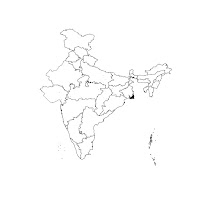 Above code results in a basic map of India as shown here. You can see in the image under the map the basic structure of the shapefile. It has two objects: a dataframe which lists the name of all the 35 states of India and another object of type "polygon" which lists formal parameters to draw the polygon shape e.g. @coords indicates the latitude and longitude positions of the state border.

For displaying various states on the map of India I downloaded the INDIA.shp from net and used the readShapeSpatial function from maptools package in R as is seen in the code snippet below:
 indMap <- readShapeSpatial("~/MSPA/Kaggle/India_SHP/INDIA.shp")
 plot(indMap)


How do we make ggplot interact with shapefiles?
For ggplot to understand the shapefile, we first have to fortify it to bring the individual polygon information into a dataframe format which can be then read using an id field. We have to take care of two points for the smooth rendering of choropleths:
- The name of the column which is used as map ID should be same both in the statistical dataset (in our case stateDb) and the shapefile dataframe (indMap.df).
- The names of states or the id should match exactly (that's the reason behind changing everything into uppercase and removing special characters as it hampers the data read at the time of rendering).
- Note: I'm also adding some dummy data to dataset stateDb because some of the state names were missing from the list resulting in a distortion of the map. So needless to say that, we need to have all ids present in the statistical dataset even if there is no data for them.
 #Convert it into a dataframe
 indMap["ST_NAME"] <- toupper(indMap["ST_NAME"])
 indMap.df <- fortify(indMap,region="ST_NAME")

 #Aggregate data state wise
 stateDb <- aggregate.data.frame(cityDb[,c(5:13,20:22)],by=list(cityDb$state_name),FUN=sum)
 #Rename the column name to merge the region information
 colnames(stateDb)[1] = "state_name"
 region["state_name"] <- gsub("&","AND",region["state_name"])
 stateDb<- merge(stateDb,region,by="state_name")
 #Count the no. of cities in top 500 list per state
 stateDb["NumCities"] <- (plyr::count(cityDb,vars=c("state_name")))$freq

 #create a dummy frame equivalent to stateDb to add the missing states data.
 #This is needed for correct rendering of the map.
 dummyStateData <- stateDb[1:7,]
 #Adding the missing states names to confirm it to the size of spatial dataframe indMap.df
 dummyStateData[,1] <- c("ARUNACHAL PRADESH","DADRA AND NAGAR HAVELI","DAMAN AND DIU",
             "LAKSHADWEEP","GOA","MANIPUR","SIKKIM")
 dummyStateData[,14] <- c("NorthEast","West","West","South","South","NorthEast","NorthEast")
 dummyStateData[,c(2:13,15)] <- NA #c(0,0,0,0,0,0,0)
 stateDb<-rbind(stateDb,dummyStateData)
 stateDb$state_name<- gsub("PUDUCHERRY","PONDICHERRY",stateDb$state_name)
 colnames(stateDb)[1] <- "id"
Now that our statistical dataset and shapefile dataset are aligned we can start using them and create some interesting and insightful maps. From here on, it will be mostly about interpreting and displaying the data rather than the nitty-gritties of ggplot. But before we progress towards that let me give you the last piece of information on how to use the shapefile dataframe in ggplot. The function that does the actual plotting is geom_map. As you will see in the code snippet below, in geom_map we specify the map attribute as our shapefile dataframe indMap.df. Similarly, to bind the stateDb with the map we give map_id attribute as the name of the field which uniquely identifies each polygon (that's why we aligned the names of state in both datasets).
The last straw is the function expand_limits which tells geom_map where the boundaries are. Without it, you'll get a blank screen.
 sex_ratio_plot <-
  ggplot(data=stateDb,aes(map_id=id))+
  geom_map(aes(fill=stateDb$population_female/stateDb$population_male),map=indMap.df,col="grey") +
  expand_limits(x=indMap.df$long,y=indMap.df$lat) +
  scale_fill_continuous(low="#ffffcc",high="#006837",name="Ratio") +
  theme(panel.border = element_rect(fill=NA,color='black'),
      panel.background = element_blank(),
      axis.ticks.x = element_blank(),
      axis.text.x = element_blank(),
      axis.ticks.y = element_blank(),
      axis.text.y = element_blank(),
      axis.title.x = element_blank(),
      axis.title.y = element_blank(),
      legend.position = c(0.1,0.2))
Now let's look at some of the maps I created using same strategy as in the above code. If you need the code please have a look at the R script on my github page.
- The first graph here is the comparison between overall sex-ratio per state and child-sex-ratio per state. Notice the difference in Child Sex Ratio and Overall Sex Ratio in states of Assam, Haryana, Himachal Pradesh. It looks like some sort of migration happening in and out of these states.

Some other plots worth having a look at:
 |
| % of cities in top 500 list per state |
 |
| Female demographics per state |
There are some other hacks that went under the construction of these choropleths. E.g.
- Removal of grid lines and axes using the theme function.
- Placing of state_name labels using geom_text_repel function from ggrepel library.
- Color coding using the advice from ColorBrewer.org. You can also download the RColorBrewer library in R for in-built support.
This all is available on github here. Happy Coding!!


Comments
Post a Comment